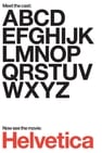
Helvetica is a feature-length independent film about typography, graphic design and global visual culture. It looks at the proliferation of one typeface (which will celebrate its 50th birthday in 2007) as part of a larger conversation about the way type affects our lives. The film is an exploration of urban spaces in major cities and the type that inhabits them, and a fluid discussion with renowned designers about their work, the creative process, and the choices and aesthetics behind their use of type.
You've never heard of Jonathan Hoefler or Tobias Frere-Jones but you've seen their work. They run the most successful and respected type design studio in the world, making fonts used by the Wall Street Journal to the President of the United States.
This film is about patient and dedicated teaching, about learning to look and visualize in order to design, about the importance of drawing. It is one designer’s personal experience of issues that face all designers, expressed with sympathy and encouragement, and illustrated with examples of Inge [Druckrey]’s own work and that of grateful generations of her students. There are simple phrases that give insights into complex matters, for example that letterforms are ‘memories of motion.’ Above all, it is characteristic of Inge that in this examination of basic principles the word “beautiful” is used several times.
We are surrounded by types, the words on signs, buses, shops and documents which guide us through our lives. Two types in particular are regarded as the faces of Britain - Johnston and Gill Sans. Their story is told by typeface expert Mark Ovenden.